mirror of
https://github.com/black7375/Firefox-UI-Fix.git
synced 2026-01-26 06:21:41 -08:00
🦊 I respect proton UI and aim to improve it.
firefoxfirefox-cssfirefox-customizationfirefox-themefirefox-tweakshacktoberfestthemeunixpornuser-interfaceuserchromeuserchrome-stylesuserchromecssuserstyles
| README.org | ||
| userChrome.css | ||
| userContent.css | ||
| wave1.svg | ||
Firefox UI FIX
proton is firefox's new design.
I want to fix some flaws.
Currently work only dark theme.
(Fixed proton design)
-
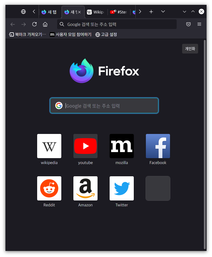
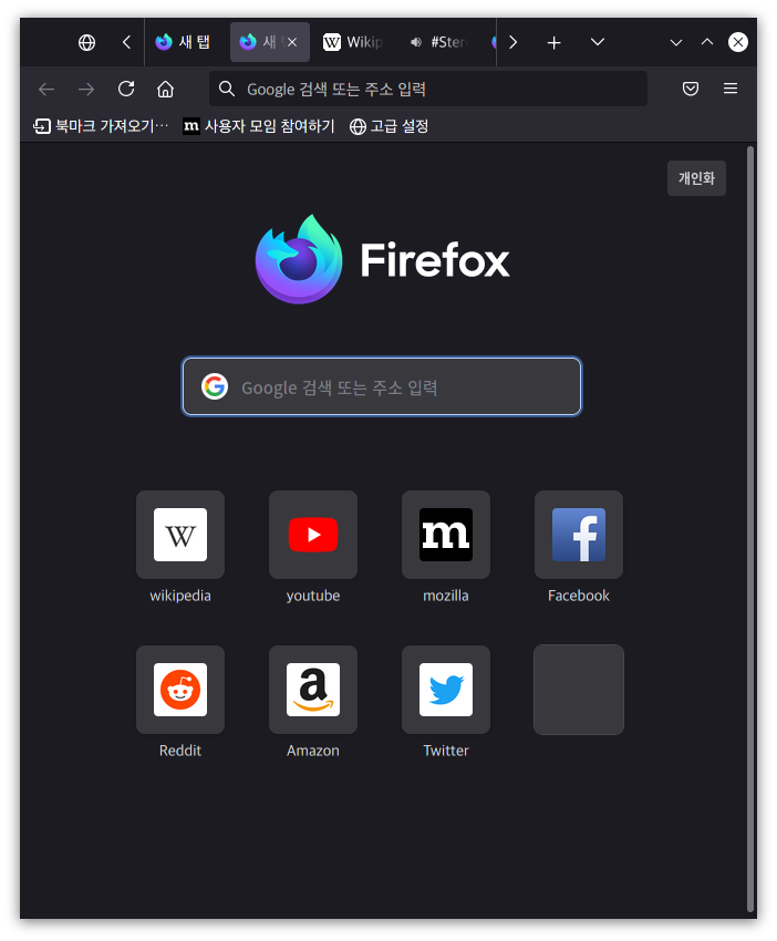
Tab Design
-
General:
- Connect with toolbar(Buttons like tabs)
-
Selected:
- Box Shadow: Highlight the selected tab
- Bottom Rounding: Natural
-
Unselect:
- Divide Line: React to hover like chrome
-
Clipped:
- Cleary Text: Adjusted clipped gradation
-
Sound:
- Show Favicon: Always show favicon
-
-
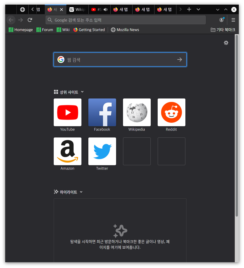
Activity Stream Design
-
Search Bar:
- Focused Shadow: Same as the accent color
-
Icons:
- Size: Fill it up
-
WHY Proton?
I think a lot has improved.
(pure proton design)
- Neatly organized menu
- Icon beautiful enough to remind you of Edge
- Nice color scheme
- Satisfied Rounding
- Modal window!!
WHY Not Proton?
However, there are also many flaws.
(proton before design)
- [x] Is it a tab or a button?
- [] Where are the menu icons?
- [x] Icons in ActivityStream are too small
- [] Padding gaps are wide
- ⚠️ Address bar 3-point menu, screenshot moves to toolbar (can't fix)